- Air Homepage
- Air Quality Modelling Service
- Air Quality Testing
- Air Quality Statistics
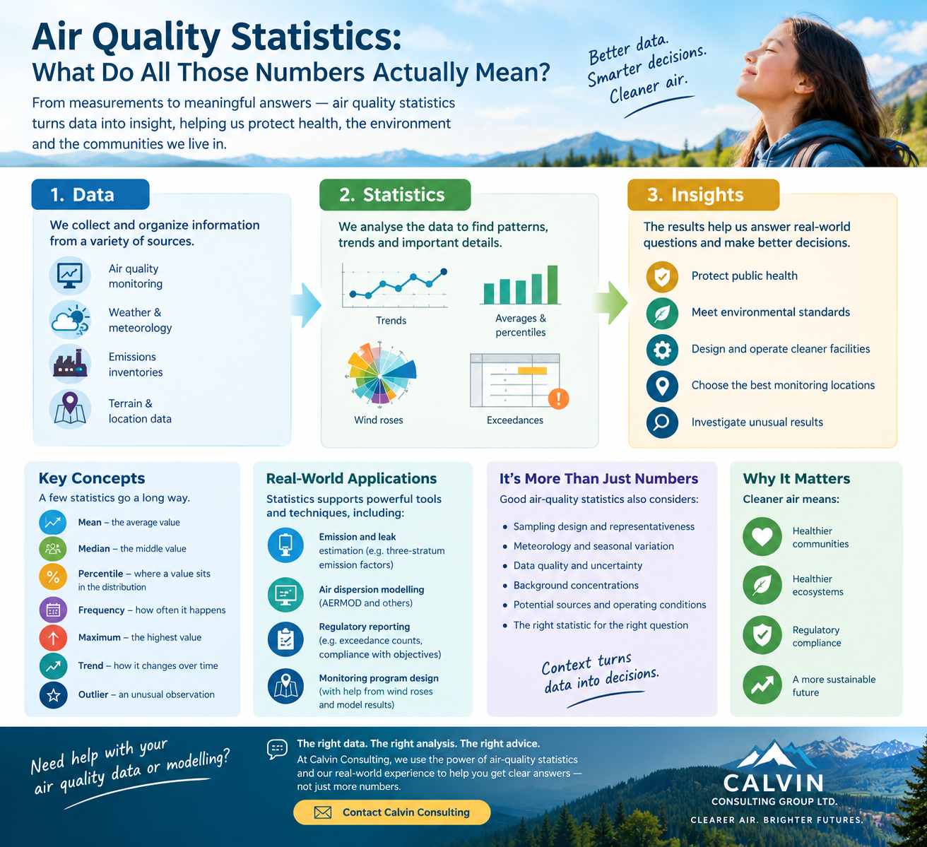
Air Quality Statistics: What Do All Those Numbers Actually Mean?
Find more air quality statistics and information.
How can air quality statistics help us understand the atmosphere?
Imagine someone hands you 43,800 measurements of nitrogen dioxide. That's five years of hourly data.
What do you do with them? You could print them all out and start counting. Good luck.
A much more useful approach is to ask questions:
- What's normal?
- What's unusual?
- How often does a high value occur?
- Is the air getting better or worse?
- Where are the highest concentrations?
- How confident are we in the answer?
That's where air quality statistics become useful. Statistics helps turn a mountain of environmental measurements into information that people can understand and decisions they can defend.
And air-quality work produces enormous amounts of data. Monitoring stations record measurements. Meteorological models generate weather fields. Emissions inventories contain thousands of sources. Dispersion models can produce years of hourly predictions at hundreds or thousands of receptors.
The trick is deciding which numbers matter.
The one-minute answer
Statistics is the branch of mathematics concerned with collecting, describing, analyzing and interpreting data. Air quality statistics applies those ideas to measurements and predictions involving pollutants, emissions and the atmosphere.
For example, suppose a monitoring station measures hydrogen sulphide once every hour. The raw data might look like:
2, 3, 2, 4, 2, 8, 3, 2, 47, 3, 2...
A list of numbers doesn't tell us very much. Statistics can tell us that:
- most measurements were low
- one measurement was unusually high
- the average was a particular value
- the 90th percentile was another value
- high readings occurred mostly under certain wind conditions
- the unusual reading might deserve investigation
Suddenly the numbers are telling a story. That is the basic purpose of air quality statistics.
What is air quality, anyway?
Before we talk about statistics, we need to know what we're measuring. Air quality describes what is in the air, how much of it is there and what those concentrations mean for people and the environment.
Some of the substances that may matter include:
- nitrogen dioxide
- sulphur dioxide
- hydrogen sulphide
- particulate matter
- carbon monoxide
- volatile organic compounds
- ammonia
- ozone
Weather matters too. Wind speed and direction affect where a pollutant goes. Temperature and atmospheric stability affect how quickly it mixes.
Rain can remove some substances from the atmosphere. Terrain and buildings can redirect or disturb airflow.
That's why air quality statistics often make more sense when they are examined alongside meteorological statistics.
A high concentration isn't just a number. It happened somewhere, at a particular time, under particular atmospheric conditions.
Six statistics worth knowing
You don't need a statistics degree to understand most of the numbers you encounter in air-quality work.
Mean: What's typical?
- The mean is the familiar average.
- Add all the measurements together and divide by the number of measurements.
- It can be useful for describing long-term conditions.
- The catch is that a few unusually high values can pull the mean upward.
Median: What's in the middle?
- Put all the values in order.
- The median is the middle one.
- For data with occasional large spikes, the median can describe a 'typical' condition better than the mean.
Maximum: How high did it get?
- This one sounds obvious.
- It can also be misleading.
The single highest reading might result from a short-lived event, an unusual wind direction or an instrument problem.
A maximum is useful. It should usually be investigated rather than worshipped.
Percentile: How unusual is a value?
- A percentile tells us where a value sits within a distribution.
- For example, the 90th percentile is the value below which 90% of the observations fall.
Regulatory air-quality work can use specified percentiles rather than simply reporting the absolute maximum. Alberta's published air-quality indicators, for example, use percentiles when summarizing monitored concentrations.
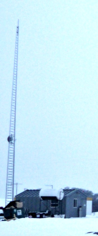
This is one reason air quality statistics can look strange to someone encountering them for the first time. A regulatory statistic isn't necessarily asking: What was the biggest number ever?
It may be asking: What concentration represents a defined portion of the data?
Frequency: How often did it happen?
Suppose an air-quality objective is 159 ppb. You may want to know: How many measurements exceeded 159 ppb?
That is an exceedance count. In a dispersion model, we may ask the same question about predicted concentrations.
Trend: Is it getting better?
- This is where statistics becomes particularly interesting.
- A few measurements can tell you what happened.
- A long record can tell you whether something is changing.
Alberta uses statistical trends and percentiles in its published air-quality indicators. For example, the province reports NO₂ and SO₂ concentrations over many years and compares them with applicable objectives.
That's air quality statistics doing one of its most useful jobs: turning a pile of measurements into a story about change.
What an air-quality statistician really wants to know
The number itself is only the beginning. Imagine a monitor reports: 12 ppb - Before celebrating or worrying, ask:
- Where was it measured?
- When?
- For how long?
- What was the wind doing?
- How many measurements were collected?
- Was the instrument working properly?
- Is this normal for the site?
- Was there an unusual event?
- What happened before and after the measurement?
This is the science of context.
A precise number isn't necessarily a useful number. A representative number is much more valuable.
Air quality statistics begins with sampling
You cannot measure everything everywhere. There isn't enough time, money or equipment.
Instead, we take samples. The challenge is making those samples representative.
Suppose you want to know the air quality around a large industrial facility.
- You could put a monitor right beside the largest stack.
- You could put another beside the office.
- You could put one at the fence line.
- You could put one farther away.
Which location gives you the best answer? There isn't a universal answer. The right location depends on the question.
- If you're investigating maximum industrial impacts, you may care about where a plume is predicted to reach the ground.
- If you're investigating community exposure, population and sensitive receptors may matter more.
- If you're investigating an odour complaint, the location and timing of complaints become important.
That's why monitoring design is itself an exercise in air quality statistics.
What makes a sample representative?
This is one of the most important concepts for students to understand. Suppose a student wants to know how tall people at school are.
They measure the basketball team. The measurements may be perfectly accurate. The sample isn't necessarily representative of the whole school.
Environmental data have the same problem.
A monitor can be working perfectly while producing data that don't represent the question you are trying to answer. This is called sampling bias.
Other problems can include:
- missing data
- unusual events
- instrument problems
- changes in operating conditions
- seasonal variation
- changing meteorology
- changes in the surrounding land use
Good environmental statistics begins with good data collection.
Meteorology turns the numbers into a story
Air pollution doesn't sit still. Wind transports pollutants. Atmospheric stability influences mixing. Temperature affects buoyancy.
Rain can remove pollutants. Terrain can redirect airflow. That's why meteorology is so closely connected to air quality statistics.
A wind rose is a particularly simple example. It summarizes thousands of wind observations into a picture showing:
- where the wind comes from
- how often it comes from each direction
- how fast it tends to blow
Instead of reading thousands of hourly observations, you can understand the dominant wind pattern at a glance.
The same principle applies to other meteorological statistics.
A climate normal summarizes years of weather. A frequency distribution shows how often conditions occur. A percentile identifies unusually high or low conditions. A probability describes the likelihood of an event.
Statistics is one of the reasons meteorology can turn an enormous stream of observations into something humans can understand.
What does this have to do with air dispersion modelling?
Quite a lot. A dispersion model such as AERMOD can calculate concentrations for thousands of combinations of:
source conditions + meteorology + receptors
For a five-year regulatory assessment, there would usually be more than 40,000 hourly conditions. And there may be hundreds or thousands of receptors. The model therefore produces a very large amount of output.
Nobody wants a report containing every number. The useful questions become statistical:
- Which receptor has the maximum concentration?
- How many predicted concentrations exceed the applicable objective?
- Which averaging periods matter?
- What percentile or regulatory statistic must be reported?
- Which meteorological conditions produced the maximum?
- How often did a predicted exceedance occur?
This is where air quality statistics turn model output into something a regulator, engineer or client can actually use.
A five-year modelling result is more than one big number
For a typical regulatory assessment, Calvin Consulting (where I work) may be asked to determine how often predicted concentrations exceed applicable standards or objectives during the modelling period.
This is often examined on a per-receptor basis. For example:
- Receptor 317 had three predicted exceedances.
- Receptor 402 might have none.
- Receptor 511 might have the highest predicted concentration.
That tells us something very different from simply reporting one maximum number.
In some jurisdictions or assessments, the number of unique meteorological conditions associated with exceedances may also be important. We may also be asked to identify the meteorological conditions associated with the maximum concentration.
That can answer a very practical question: Why did the model predict the maximum here?
The maximum might occur under a particular combination of wind speed, wind direction and atmospheric stability. That information can be more useful than the maximum value by itself.
An example from Alberta
Alberta's Ambient Air Quality Objectives are used in regulatory applications and to assess impacts from regulated activities. Alberta's current framework requires specified activities to conduct air-quality modelling in accordance with the Air Quality Model Guideline.
That means a modelling assessment may have to answer statistical questions such as:
- How many predicted concentrations exceed an objective?
- Where do those exceedances occur?
- What is the controlling receptor?
- Which averaging period controls the verdict?
- What meteorological conditions are associated with the maximum?
- How do predicted concentrations compare with background concentrations?
These are air quality statistics with a regulatory purpose. The exact statistic required depends on the applicable jurisdiction, pollutant, objective and modelling methodology.
That's important because there is no universal one statistic fits all answer.
Monitoring and modelling tell different stories
Monitoring and modelling tell different stories It helps to keep these two ideas separate.
- Monitoring - What actually happened here? A monitoring station measures the atmosphere at a particular location and time.
- Modelling - What is predicted to happen under these defined conditions? A model estimates concentrations using emissions, meteorology, terrain, buildings and receptors.
- Statistics - What does the large collection of measurements or predictions tell us?
Put them together:
- Monitoring → data
- Modelling → predictions
- Statistics → patterns and evidence
That three-part system is much more powerful than any one component by itself.
Finding the representative monitoring location
This is one of the practical uses of air quality statistics at Calvin.
Suppose a client needs an ambient monitoring station. The first instinct might be: Put the monitor wherever it is easy to access.
Convenient? Yes.
Representative? Maybe.
At Calvin, modelled concentration patterns and wind-rose information can help identify locations where a monitor is more likely to capture the air-quality behaviour that matters. Then practical considerations enter.
- Is there electrical power?
- Is the location secure?
- Can technicians reach it year-round?
- Is the site accessible during bad weather?
- Can the equipment be installed safely?
- Is the property available?
A statistically sensible monitoring location still has to work in the real world...
When the modelling, meteorology and practical site constraints are considered together, we can help clients choose a location that makes sense scientifically and operationally.
Statistics can also help diagnose a problem
Statistics isn't just for reporting results. It can help explain them.
Suppose an air-quality monitor begins recording unusually high H₂S concentrations. We can ask:
- When did the high values occur?
- What direction was the wind coming from?
- Was a nearby facility operating differently?
- Were the high values associated with a particular time of day?
- Did the concentration rise gradually or suddenly?
- Did another monitor see the same pattern?
A pattern in the data can point toward a source or operating condition. This is where environmental statistics starts to feel a little like detective work.
How do we estimate emissions when there are hundreds of leaks?
Now for a very practical example. Imagine a gas plant with hundreds of valves, connectors and other potential leak points. Leak specialists call these fugitive emissions.
You could try to measure every source individually. That can be expensive and time-consuming.
Leak-detection programs can instead use measurements from representative equipment and established emission factors or correlations to estimate emissions across a larger population.
Calvin's leak-detection team continues to use the three-stratum emission-factor approach for making decisions in this kind of work. The basic idea is easy to understand.
Instead of treating every leak as a completely unique problem, sources can be placed into appropriate categories or strata.
A statistical relationship can then be applied to each group to estimate total emissions. This can make the inventory much more practical.
But statistics doesn't magically make the answer true
This is an important professional lesson. Suppose a published correlation predicts that a particular valve type emits 0.5 grams per hour. That does not mean every valve emits exactly 0.5 grams per hour.
The correlation represents a population. Individual equipment can behave differently. A correlation developed for one facility may not represent another facility equally well.
A measurement campaign may have unusual equipment or unusual operating conditions. A sample may be too small. An emission factor may be inappropriate for the source.
That's why experienced consultants treat statistical methods as tools that still require judgement. The question isn't: Does the equation work?
Rather, it's: Is this a reasonable equation for this population, under these conditions, for this purpose? That is a much better question.
Three kinds of uncertainty
Environmental statistics also teaches a useful lesson about uncertainty.
Measurement uncertainty - The instrument isn't perfect.
Sampling uncertainty - The measurements may not represent everything happening at the site.
Model uncertainty - The mathematical model is an approximation of a complicated physical system.
There can also be uncertainty in:
- emission rates
- operating conditions
- meteorology
- background concentrations
- terrain
- source locations
The existence of uncertainty doesn't make the analysis useless. It tells us how cautiously the result should be interpreted. Good science makes uncertainty visible.
What an experienced modeller checks
At Calvin, we routinely compare model inputs against information provided by clients and engineering firms.
We also ask whether the numbers make sense together. For example:
- Is the emission rate plausible for the equipment?
- Does the stack diameter make sense for the flow?
- Does the exit velocity look reasonable?
- Does the predicted maximum occur where the wind pattern suggests it should?
- Are the concentrations sensitive to a particular assumption?
- Does a strange result indicate a real physical effect or a data problem?
Sometimes statistical analysis reveals an apparent anomaly. The right response isn't automatically to delete it.
First ask: What happened? An outlier could be an instrument problem. It could also be the most interesting observation in the entire dataset.
Air quality statistics is also about telling the truth clearly
One of the problems with environmental data is that enormous amounts of information can create an illusion of certainty.
A report can contain thousands of numbers. That does not mean the underlying answer is certain to many decimal places.
A good statistical summary makes the important information easier to see while keeping its limitations visible. That's why Calvin Consulting reports distinguish between measured information, client-provided information, estimates, model predictions and professional assumptions.
The numbers need context. The context needs to be understandable. And someone needs to be prepared to question both.
What statistics cannot do
Statistics cannot repair a bad measurement. It cannot make an unrepresentative sample representative.
It cannot turn an inappropriate emission factor into a good one. It cannot make an incorrect model physically correct. It cannot tell you why an outlier occurred without additional investigation.
It can help reveal these problems. That's a big part of its value.
Air quality statistics doesn't replace scientific judgement. It gives scientific judgement better evidence to work with.
Where statistics meets meteorology
This is where air-quality statistics becomes part of the bigger Stuff in the Air story. Meteorology is full of statistics.
- Climate normals.
- Wind roses.
- Rainfall frequencies.
- Temperature distributions.
- Storm probabilities.
- Return periods.
Air-quality studies use many of the same ideas. A five-year meteorological dataset is more than just a pile of weather observations. It is a description of the range and frequency of atmospheric conditions that a source is likely to encounter.
A dispersion model then uses those conditions to predict concentrations. Statistics helps us summarize what happened. Meteorology helps explain why it happened. Modelling helps estimate what could happen.
That is a powerful combination.
Can you do the analysis yourself?
Absolutely. For learning purposes, working with environmental data is a terrific way to understand statistics, meteorology and air quality.
- Download some data.
- Make a graph.
- Plot a wind rose.
- Find the median.
- Calculate a percentile.
- Look for an outlier.
- Ask what might have caused it.
- That's how statistics becomes real.
A regulatory project is different. The difficult part is often deciding which data to use, which statistics matter and what the result actually means.
A computer can calculate a percentile. It cannot decide whether the sample was representative.
A model can produce an exceedance count. It cannot decide whether the source inputs were reasonable.
A spreadsheet can calculate a correlation. It cannot tell you whether the relationship should be trusted at another facility.
That is where an experienced specialist earns their keep.
Need help with air-quality data or modelling?
You can collect the data. You can build the spreadsheet. You can download the model. You can generate the graphs.
The more important question is whether all that work is answering the right question.
At Calvin Consulting Group Ltd., we use environmental statistics for practical purposes including dispersion-modelling assessments, exceedance analysis, emissions estimation, leak detection, monitoring-location decisions and investigation of unusual results.
If youneed, our leak-detection team continues to use three-stratum emission factors where appropriate.
Our modelling team uses five-year meteorological datasets and model output to determine maximum concentrations, exceedances, controlling meteorological conditions and other statistics required for regulatory assessments.
We also use wind-rose information and predicted concentration patterns to help clients choose practical monitoring locations while considering real-world constraints such as access and site logistics.
Senior Calvin modellers provide QA/QC and review the assumptions behind the numbers. Rather than produce more data, the goal is to turn the right data into a defensible answer.
Getting specialist advice before building a monitoring program or modelling study can save far more than the cost of correcting a statistical mistake later.
Good statistics help you see the pattern. Professional judgement helps you understand what the pattern means. Reach me at...

...with any further questions you may have.
Personally, I specialize in the air dispersion modelling department.
Go back from Air Quality Statistics to the Air Quality Testers web page, or...
Search this web site for more information now.
Where should you go next?
This page is the data-and-mathematics doorway into the wider Stuff in the Air library.
Want to understand the subject first?
What Is Air Quality?
Learn what pollutants are and how emissions become ambient concentrations.
Want to see what the numbers say?
Air Pollution Facts
Explore long-term trends and some surprising air-quality successes.
Want to understand the weather?
Weather and Meteorology
Explore the atmospheric processes behind wind, temperature, precipitation and storms.
Want to measure air quality?
Air Quality Monitoring
Learn how instruments and monitoring programs collect environmental data.
Want to predict concentrations?
Air Dispersion Model
Learn how to choose between AERMOD, CALPUFF and other modelling approaches.
Want to understand the workhorse model?
AERMOD: Alberta's Workhorse Air Dispersion Model
See how emissions, meteorology, buildings, terrain and receptors become model predictions.
Want the technical deep dive?
Air Quality Dispersion Modelling
Explore the science and practical workflow in more detail.
That is the real purpose of this page.
It isn't supposed to be the final stop. It's supposed to make the rest of the subject easier to understand.

Recent Articles


-
Air Quality Statistics: What Do All Those Numbers Actually Mean?
Sep 21, 26 12:00 AM
 How are air quality statistics used to understand pollution, design monitoring programs, estimate emissions and make environmental decisions?
 -
Surprising Air Pollution Facts: It's Not All Bad News!
Sep 17, 26 06:14 PM
 Trying to improve air quality has been a priority. Here are some air pollution facts to show you how far we've come.
 -
What is air quality and how can we fix it?
Sep 16, 26 11:19 AM
What is air quality? How do you define good air quality? It's just the opposite of air pollution.


Three levels of air-quality statistics
Level 1 — I'm new to this
Statistics helps us summarize lots of measurements so that we can see patterns. Instead of reading 10,000 numbers, we can ask:
- What's typical?
- What's unusual?
- How often does it happen?
- Is it changing?
Level 2 — I'm a student
Learn these ideas:
- Mean → average
- Median → middle value
- Percentile → position within the distribution
- Frequency → how often something happens
- Trend → how something changes over time
- Correlation → whether two variables tend to change together
- Outlier → an unusually different observation
Then try applying each concept to wind, temperature, rainfall or pollutant concentrations.
Level 3 — I'm working on a real project
Now you need to think about:
- Sampling design
- Data quality
- Representativeness
- Meteorology
- Emission factors
- Regulatory statistics
- Exceedance frequencies
- Background concentrations
- Model output
- Uncertainty
- QA/QC
The mathematics may be familiar.
The difficult part is deciding whether the statistical result answers the question you actually have.
Do you have concerns about air pollution in your area??
Perhaps modelling air pollution will provide the answers to your question.
That is what I do on a full-time basis. Find out if it is necessary for your project.
Have your Say...
on the StuffintheAir facebook page
Other topics listed in these guides:
The Stuff-in-the-Air Site Map
And,
Thank you to my research and writing assistants, and the author remains responsible for the content.
A small air-quality statistics challenge
Imagine these five one-hour H₂S measurements:
1, 2, 2, 3, 22
What would you report?
- The average is 6.
- The median is 2.
- The maximum is 22.
Those numbers tell three different stories.
The average says the overall value was pulled upward by the large observation.
The median says most measurements were close to 2.
The maximum says something unusual happened.
Now ask the really interesting question: Why was the last measurement so high?
- Check the wind.
- Check the source.
- Check the instrument.
- Check the operating conditions.
- Maybe the 22 is an error.
- Maybe it's a genuine release.
Statistics has identified the mystery. It hasn't solved it.
That's where investigation begins.

By Barry Lough, P.Met., EP (Environmental Professional)
Text copyright © 2003-2026 Stuff in the Air.com
BACK TO TOP - Hit your 'Home' Key