- Air Homepage
- Upper Atmosphere
- First Law of Thermodynamics
Meteorological insights - Powered by First Law Thermodynamics
Why would you care about first law thermodynamics and atmospheric physics?
Atmospheric thermodynamics: The Engine of Weather - Imagine a hidden law of physics explaining how storm clouds form and how air cools down to become rain! Check out the special charts meteorologists use to uncover the secrets of our atmosphere and the powerful First Law of Thermodynamics.
Find more about atmospheric physics.
Discover how heat shapes our world, from cozy fires to weather patterns, when you explore thermodynamics. The dynamic dance of the atmosphere captivates your imagination, revealing the science behind weather phenomena. These two subjects provide a unique window into how natural forces interact, fostering curiosity about our planet's inner workings and appreciation for how science works.
One thing students learn is that energy can't appear or disappear. The only thing it can do is change form. In other words, you can't create or destroy energy, but you can transfer and transform it. Energy can move between a system and its surroundings, changing forms. The first law of thermodynamics can be expressed mathematically as:
ΔU = Q - W
This equation has ΔU as the change in internal energy, Q as the heat added to the system, and W as the work done. In this equation, heat or work, or both, must be added to a system when its internal energy changes. In many physical systems, this law is used to measure the energy change in a system.
 Combining physics, math and thermodynamics
Thus in a confined system, like a single room, the total energy changes when heat energy is added minus work done by the system on its surroundings (blowing out the walls, for example).
According to the first law of thermodynamics, you can calculate the change in "real" temperature. By adding or subtracting heat, minus the energy returned by expanding or compressing the air, it would increase or decrease.
That's what meteorologists call the potential temperature. We need a bunch of instruments that measure temperature at different pressures. Then we can apply this first law thermodynamics.
What is this important weather instrument package? It's called a radiosonde. Hundreds of helium-filled weather balloons go up every day around the world, so we can build a crude model of the upper atmosphere. For weather forecasting, it's crucial.
To interpret the data, meteorologists use thermodynamic charts like skew-T log-P, tephigrams, and hodographs. Many standards are incorporated into them, like the first law of thermodynamics.
You can also analyze data with an upper isobar weather map. They let you compare data from multiple locations at once.
The tephigram chart
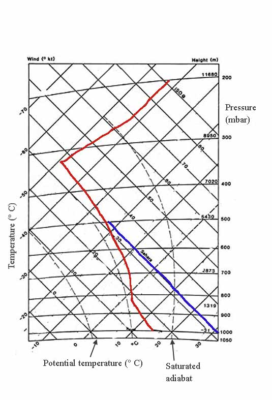
...is used by forecasters in many countries, including Canada. The area within an isobaric box on this chart is proportional to the energy involved in a physical change. By doing this, you can see how the first law thermodynamics works.
In the example above, there are no labels for them. Under the same conditions as the previous illustration, completely saturated air goes up the hill.
First law thermodynamics example
There's a big difference between moist and dry air. Look at the space between the red and blue lines at 800 mbar. It's all latent heat from evaporation or condensation. That's the heat moisture gives off or absorbs when it goes from vapour to liquid.
The blue one is the dry one; that's why it's called Sahara. At sea level, around 1000 mbar, it easily reaches 30's or more (or 90's and above Fahrenheit).
A set of faint broken lines slants up to the right at a steeper angle than the isotherms if you look closely. This chart doesn't show these lines well but those values are also important. They're saturation mixing ratios. The lines correspond to specific vapour contents and are labelled in grams of water vapor per kilogram.
Additional features
Nomograms can be included in more elaborate diagrams. Nomograms are tables and scales that make quick calculations, like converting dew point temperatures to frost points in cold areas. Like an old slide rule, they make analog rule-of-thumb calculations.
Nomograms let meteorologists figure out heights and thicknesses of air packages, elevations at interpolated pressure levels, and virtual temperatures. Humid air's virtual temperature is the temperature dry air would have to be to have the same density as humid air. Water molecules are lighter than air, so it's usually a degree or two higher. A higher temperature will compensate for that.
We can also plot wind data on a chart called a hodograph. Wikipedia has more info on this one.
#29
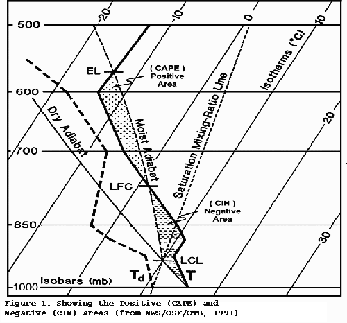
Skew T Log P diagram
This graph is a good alternative to the tephigram. The similarities outweigh the differences, and the USA National Weather Service seems to prefer this one.
All the other curves are gentle, except for the isotherms, moisture content, and isobars. The first law of thermodynamics and other laws don't change.
You can see the latest skew-t plots for various locations in the US and Canada.
Search this site for more information now, or go back from First Law Thermodynamics to the
Chasing Storms web page.
How do YOU use the laws of thermodynamics in the study of weather?
Interpreting information using the first law of thermodynamics. Data is collected from the upper atmosphere by weather balloons.
Do you have concerns about air pollution in your area??
Perhaps modelling air pollution will provide the answers to your question.
That is what I do on a full-time basis. Find out if it is necessary for your project.
Have your Say...
on the StuffintheAir facebook page
Other topics listed in these guides:
The Stuff-in-the-Air Site Map
And,
Thank you to my research and writing assistants, ChatGPT and WordTune, as well as Wombo and others for the images.
OpenAI's large-scale language generation model (and others provided by Google and Meta), helped generate this text. As soon as draft language is generated, the author reviews, edits, and revises it to their own liking and is responsible for the content.


New! Comments
Do you like what you see here? Please let us know in the box below.