How Upper Air Charts Decode Atmospheric Patterns to help Your Plans
Weather forecasters and other forecast office staff can explain elaborate principles faster with upper air charts.
How these Air Charts Predict Weather - Read the winding curves of wind miles above the Earth to predict your next major storm or heatwave. Use upper air charts to map the powerful jet stream currents that control all your weather-dependent plans instead of guessing.
Find more about meteorology.
How do they do it? The high elevation weather maps show a lot of curves bending from left to right. These upper air plots are made from data from the upper air sounding system.
Is there anything about weather charts showing high level pressures and wind flow info you might like. Weather charts are great for predicting what the weather will be like in the near future, since they show pressure systems and wind patterns. You can also use them to figure out what caused an event, like heavy rain or a heatwave.
Why are these charts so special?
There are a few reasons why the general public should care about upper air weather charts. I'll give you a few examples:
- Weather charts in the upper air provide information about current and forecasted atmospheric conditions, such as temperature, humidity, and wind patterns, which can affect outdoor activities like hiking, biking, and picnicking. People can plan their activities accordingly by checking the charts and avoid bad weather.
- For travelers planning a trip to another city or country, upper air weather charts are helpful. They can check the charts to see what the weather will be like at their destination and pack accordingly. Moreover, the charts can be useful if there are any weather-related disruptions.
- Farmers and agriculture workers rely heavily on weather conditions. Upper air weather charts can tell you about precipitation patterns, temperature fluctuations, and wind speeds, which can affect crop growth and yields.
- In the event of a natural disaster, such as a hurricane or tornado, upper air weather charts are valuable tools for emergency responders. By knowing the direction and strength of the storm, people can take precautions and evacuate if needed.
Curves are lines of equal height above sea level that reach a specified pressure. Each upper air analysis map tells us what pressure we're dealing with.
Upper air charts sometimes have curves that lie snugly together, then spread out in other places. These lines represent upper air winds. Where the lines spread apart, there are lower intensity upper air currents.
Like a river or gulf stream jet, gulf stream jet, these streams meander, merge, and separate a lot. It can look pretty random too.
Group kinetics - atmospheric streamlines
Streams like this are steady upper air currents. A thousand miles long and over a hundred wide, they can last for a few days. You can see them on a forecast jet stream map.
Take a look at one of these charts. There are streamlines that span a lot of distance. Smaller streamlines might only have a regional effect, but the biggest cover a lot of ground.
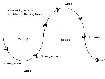
Zonal Flow is straight west-east motion in either direction. The meridian flow is the opposite. As it crosses the map, it takes a roundabout route, swinging north and south.
Air flow research and upper air charts
It's possible to see two or more streams at once over the same continent or ocean on an upper air map. The high and low points of two streams line up directly above (north and south of) each other when they're in phase. It might look like they're merging for a while.
Out of phase means the big humps aren't neatly aligned.
The map shows streams as a bunch of constant pressure-height contour lines. What's so important about this?
In a summary or forecast plot, one of those lines is the control line. This is the best line to show someone on your weather map. It passes north or south of a vorticity maximum.
Many public forecasts show a single line for the jet stream. On upper air analyses maps, it doesn't appear as a single line, but rather as a group of curves that flow together and apart.
#22
Search this site for more information now.
Simulation Streamlines
I'll go a bit deeper here on streamlines. Lines on weather maps show where the wind blows in the same direction and at the same speed. Weather patterns can be predicted by these lines, which show the movement of air masses in the atmosphere.
Weather maps show the direction and speed of the wind at different altitudes thanks to streamlines. They can identify areas of high and low pressure, and storms and fronts by analyzing these maps.
In weather maps, streams are typically drawn in blue or white and are often accompanied by isobars, which are lines connecting points of equal pressure. By combining these lines, forecasters can get a visual representation of the wind and pressure patterns in the atmosphere.
A thorough bureau meteorology analysis gives forecasters critical tools like streams and control lines. They help us make better predictions and present our information to untrained audiences.
Overall, although upper air charts might not be of interest to everyone, they can be useful for those who need to plan their activities around weather conditions, like farmers, travelers, emergency responders, and anyone else affected by the weather.
Go back from Upper Air Charts to the Chasing Storms
webpage, or visit the Stuff in the Air homepage.
What does the air upstairs do to you?
Meteorologists use upper air charts when starting to produce a forecast. What happens to our weather at ground level depends on what is coming in at upper levels.
Do you have concerns about air pollution in your area??
Perhaps modelling air pollution will provide the answers to your question.
That is what I do on a full-time basis. Find out if it is necessary for your project.
Have your Say...
on the StuffintheAir facebook page
Other topics listed in these guides:
The Stuff-in-the-Air Site Map
And,
Thank you to my research and writing assistants, ChatGPT and WordTune, as well as Wombo and others for the images.
OpenAI's large-scale language generation model (and others provided by Google and Meta), helped generate this text. As soon as draft language is generated, the author reviews, edits, and revises it to their own liking and is responsible for the content.


New! Comments
Do you like what you see here? Please let us know in the box below.